Case study: building a product system that scales
Role: Senior Product Designer, Product Manager, Project Manager, FE Engineer
Company: Nextpoint
Timeline: 2024–2026
Focus: Design Systems, Product Infrastructure, Design Tokens, Component Architecture, Design & Engineering Collaboration
Problem
As Nextpoint expanded its product suite over nearly two decades, teams were increasingly feeling the effects of scale.
Different designers had solved similar problems in different ways for years.
Engineers familiar enough with the product could identify existing UI code for reuse, but had achieved it by modifying the styling of ui elements throughout the product to fulfill nuanced requirements.
Thousands of lines of CSS had had long been unmanageable, increasing delivery timelines for every product change and introducing unforeseeable bugs with each release.
Product teams needed to move quickly, but a lack of transparency into the product created painful bottlenecks around the few folks who actually understood the product.
The challenge was no longer designing individual features.
The challenge was designing the infrastructure that would allow dozens of future features to be built more efficiently, consistently, and with greater confidence.
I pitched, designed, and built TuscanyDS to address that challenge.
Solution
Rather than treating the product as a collection of UI components, we approached Tuscany as product infrastructure: a shared foundation that could reduce entropy, accelerate delivery, and create alignment between Design and Engineering.
entropy
/ˈentrəpē/
In design systems and product organizations, entropy is the natural tendency for a product to become more inconsistent, fragmented, and difficult to maintain over time.
Audit
I audited existing product experiences, reviewed our component inventory, met with engineers, and identified places where design and implementation had begun to drift apart.
What I found wasn't a component problem. It was a lack of system infrastructure.
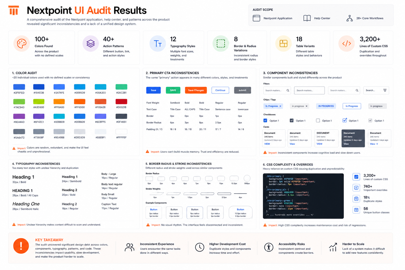
The same interaction patterns appeared multiple times throughout the platform, often with slight variations. Accessibility requirements were being solved repeatedly, if at all. Teams were making reasonable local decisions, but without a shared system those decisions accumulated into complexity.
100+ unique hex values in use across the platform
40+ variations of buttons, links, and action controls
Accessibility standards were extremely low
Multiple competing spacing systems appearing across products
Dozens of undocumented table patterns and workflow components
Significant divergence between Figma components and their production counterparts
Thousands of lines of CSS containing duplicated visual decisions was brittle and error-prone
The product had accumulated both technical debt and design debt over time. More importantly, it lacked a common language between design and engineering.
Design
Rather than starting with components, I started with foundations.
Tokens & CSS Variables
We established a token architecture that separated raw values, defined as primitive tokens, from intended usage by translating them into semantic tokens. Colors, typography, spacing, radius, elevation, and other foundational decisions were defined by became reusable system assets instead of one-off design choices.
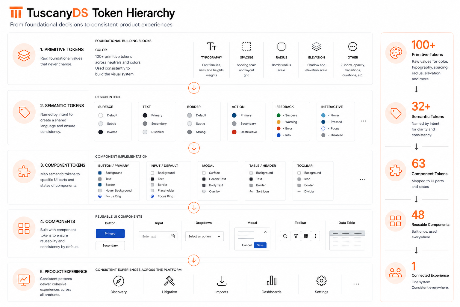
This allowed designers to work with intent rather than individual values while giving engineers a more stable implementation model. Components would inherit these decisions automatically.
Components
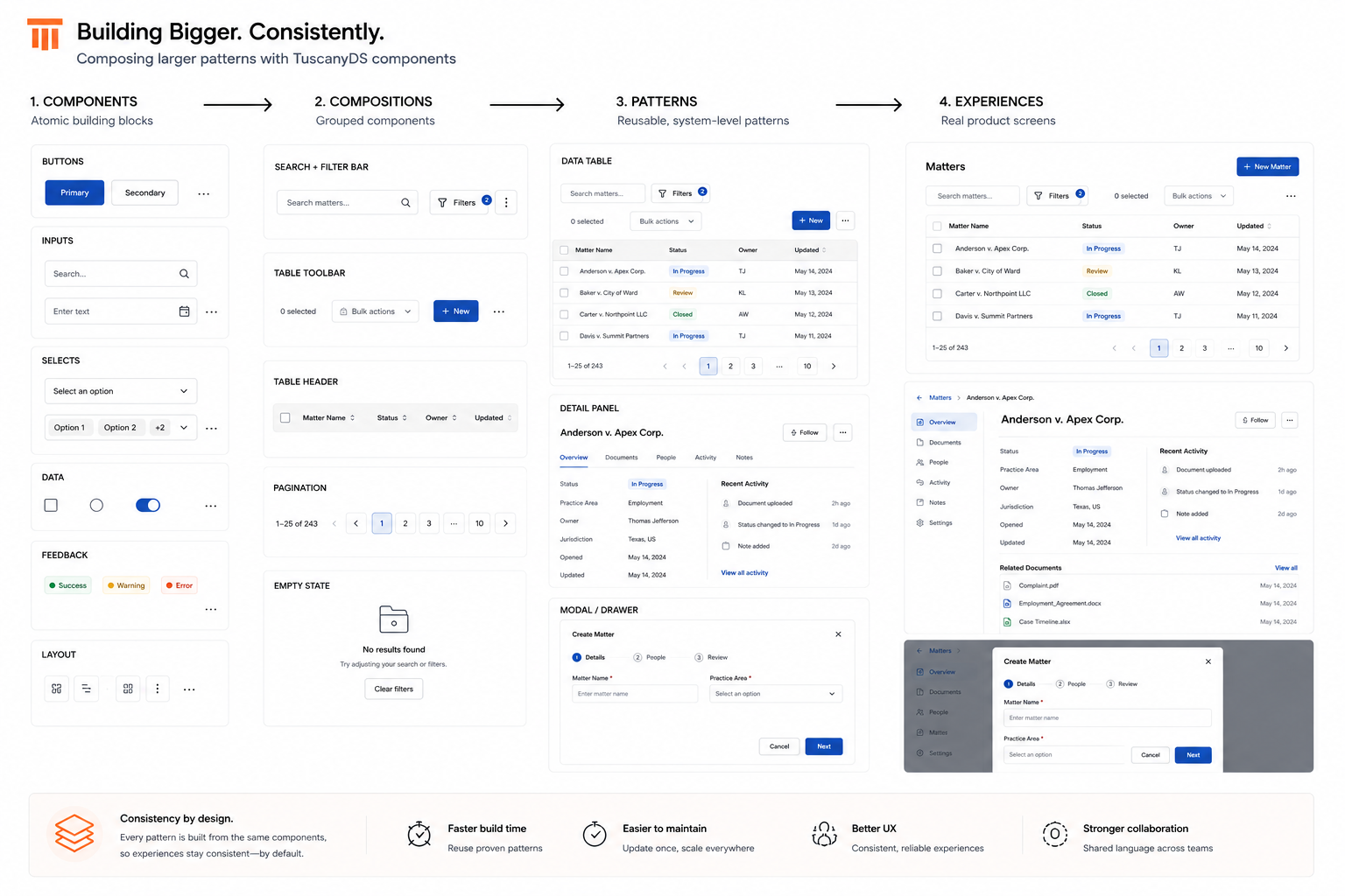
Once the foundation was in place, we rebuilt the design library around reusable patterns. I designed the system from scratch, using IBM’s Carbon Design System as a guide.
Buttons, inputs, drop downs, modals, tables, toolbars, and other shared elements were standardized and connected to the underlying token architecture. Particular attention was given to complex enterprise workflows and data-heavy experiences built on AG Grid.
Patterns
I mentored the other designers and the organization that not all components are equal. By applying Atomic Design principles, some components would serve as simple building blocks, while others represent complex product patterns containing years of accumulated business logic and user expectations.
Accessibility
Accessibility was built directly into the foundation through standardized typography scales, WCAG-compliant color pairings, and documented component states. Teams inherited accessibility from the system rather than having to solve for it repeatedly. Individual components would handle their own keyboard accessibility.
Build
Throughout the design process, I partnered closely with engineering to ensure the system would exist in production, not just in Figma.
I needed to educate the team and organization on how our design workflow was changing.
Highlights
I connected Figma to the code base using Code Connect to allow engineers to see changes in the system within VSCode.
I implemented Storybook, an open source tool that displays design systems in the browser, combining components with documentation, creating a shared source of truth that reduced implementation drift and improved collaboration.
I wrote my own Jira tickets to handoff to FE Engineers.
I used Claude Code to write 80% of the React code myself when engineering resources became unavailable.
I prototyped 10+ key features and views to validate that the system worked with engineering leads, product managers, and internal stakeholders.
Implementation
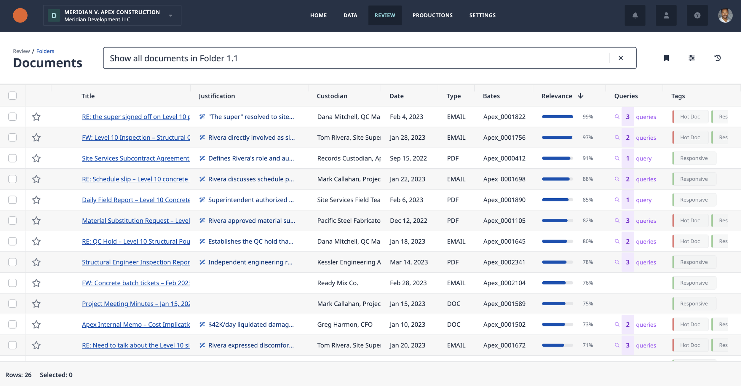
The success of a design system depends less on what gets built and more on what gets adopted.
To support adoption, I established documentation standards, contribution workflows, governance guidelines, and regular feedback loops between design and engineering.
The objective was not control. It was creating enough structure that product teams could move independently while still moving in the same direction.
Within the first year, more than 75% of newly designed experiences were built using TuscanyDS components and tokens, significantly reducing the introduction of net-new UI patterns across the platform.
Adoption extended beyond new feature development. More than 40 legacy screens were rebuilt using TuscanyDS patterns, helping reduce implementation drift and create a more consistent experience across the platform.
As adoption increased, conversations shifted away from visual inconsistencies and toward higher-value product discussions. Designers spent less time recreating patterns. Engineers spent less time interpreting design intent. Product teams gained confidence that new experiences would feel like part of the same platform.